
Appointment display for complex businesses
I designed two distinct methods of visualizing and filtering appointments for teams
Client: ‘Epicurious’ (NDA-friendly name) is a SaaS appointment-booking software for professionals.
Role & team: Product designer, part of a freelance team alongside a project manager

Context
Epicurious’ calendar was not user friendly for all types of businesses.
While most businesses on the app were solo performers, large teams struggled with filtering appointments by employee or location. Teams also needed a history view for appointments, a simplified list without a calendar view, but it was not in an accessible location.
Key metrics & impact
Task success
Many users had usability problems when filtering appointments.
Scalability
Users with large teams would look for another solution if the calendar didn’t change.
Premium conversions
The calendar is the first page new users interact with, and a key conversion item.
Discoverability
Users needed to understand at a glance the relationship between color and agenda.
Key jobs-to-be-done
Collected from user feedback on the old designs.

Assumptions
Full color for appointment cells is not enough, need additional visual cues for accessibility and type of agenda
Separate “agenda view” from “filters”; only agenda views will modify color
Challenges
The client wasn’t sure if the list view would be just a list, or a table.
The “list” view/ appointment history was in another part of the app (finance) and lacked filters.
No relationship between “agenda views” and “filters”, leading to 2 different buttons
First iteration: calendar
This iteration was a quick redesign of the existing calendar. Note the filters tab is separate form the “View” button, which was supposed to modify a calendar cell’s color and title (based on Service, Employee, or Location).

First iteration: list
The list contains appointments in a different format.

Research & feedback
I used extensively Google Calendar, Amie, and Cron Calendar (before Notion’s acquisition) to understand filter placement and event cell behavior.
Here’s what I discovered:
(Assumption validated) Appointment cell works well with additional visual cues.
The navigation rail took too much visual space, needed to design a collapsed version.
Hiding the filters in a button didn’t achieve the primary job-to-be-done. Needed to display them prominently.
Filters had to exist in the list view as well.
Appointment cells
These follow a pre-set patter that updates based on the (former) View tab based on a single selection between Service, Employee, Location.

Filter appointments

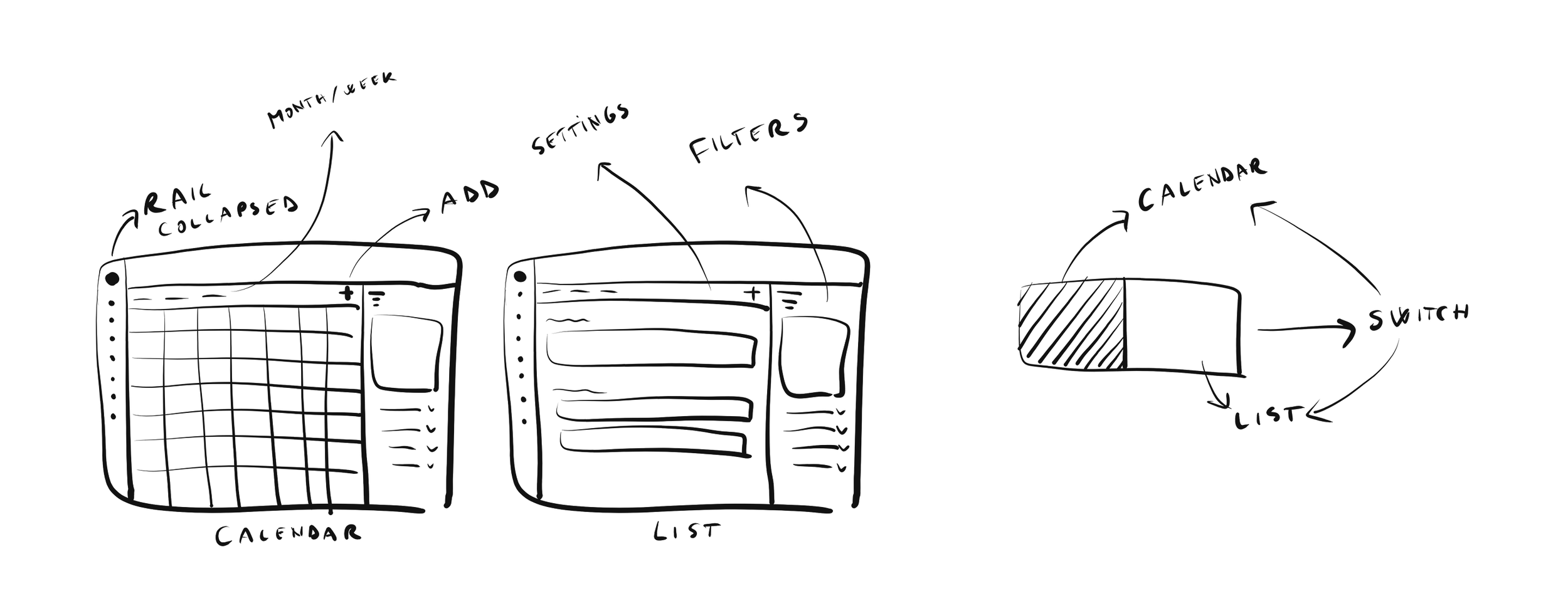
Sketch
New calendar and list (left). Overlapping the 2 sketches produced a breakthrough moment and led to calendar/list switch (right) that preserves the filters.
Final calendar
Images show: desktop and mobile screens.


Final list
Images show: desktop and mobile screens.


Outcome:
Conversions: The calendar looks more appealing and more intuitive to use, which encourages free-tier users to switch to Premium.
Functionality: The new List view allows businesses to quickly access a place where they can overview and export appointments
Success rate: Users have an easier time filtering appointments and visualizing by color.