
Create appointments manually
I designed an interactive event modal that lets users create appointments manually
Client: ‘Epicurious’ (NDA-friendly name) is a SaaS appointment-booking software for professionals.
Role & team: Product designer, part of a freelance team alongside a project manager

Context
Over 90% of the professionals on the platform use a reservation widget (like Calendly’s) for asynchronous appointment booking.
But some businesses require on-site, manual booking. The platform didn’t have a user-friendly solution for them, relying on a 2-step full-screen form modal lacking in all required inputs.
Key metrics & impact
Task success
Many users had usability problems when adding an appointment manually.
Scalability
The software needed to become a solution for all booking needs, not just asynchronous ones.
Time to completion
The process of adding an appointment manually was perceived as long.
Retention
Users having difficulty with manual booking would look for simpler solutions.
Reconstruction
This is a low-fidelity reconstruction of the old design.

Assumptions
Reduce the 2-step modal process to 1 for faster completion time
Reduce cognitive load with an interactive event modal instead of a full-screen overlay
Concerns I raised
Too many inputs (research proved me wrong)
Interactivity → visual feedback through a “skeleton” cell, uncovered by the modal
Sketch
Shows interactivity. Initial one was drawn in my sketchbook, this was redrawn in Krita for legibility.

Research, phase 1
The client discussed with their users to find all the key data they needed.
I ran a competitive analysis on Google Calendar, Cron Calendar (before Notion) & Amie. The interactive event modal was a stable pattern that could hold all required inputs.

First iteration
Purpose:
To design the interactivity of the new modal
To test with all user-reported inputs and learn which were the most important. At this stage, we didn’t have a good idea of what was “optional”.

Research, phase 2
I interviewed orthodontists in my town about their manual booking process and watched them use a less sophisticated software for on-site bookings.
Primary question: Can I see how you create an appointment?
Orthodontists created a future appointment for their client right after the end of a session, to check for availability
The orthodontists’ input order was Client → Service → Date & Time
We chose to start with Service because it affects the Seats (for group sessions) input that’s in the Client section
The client ran their testing sessions in parallel and reported back their findings:
The form looked intimidating and difficult to understand.
Some data was optional and could be hidden with progressive disclosure.
Categories of data emerged from watching orthodontists input only the necessary data
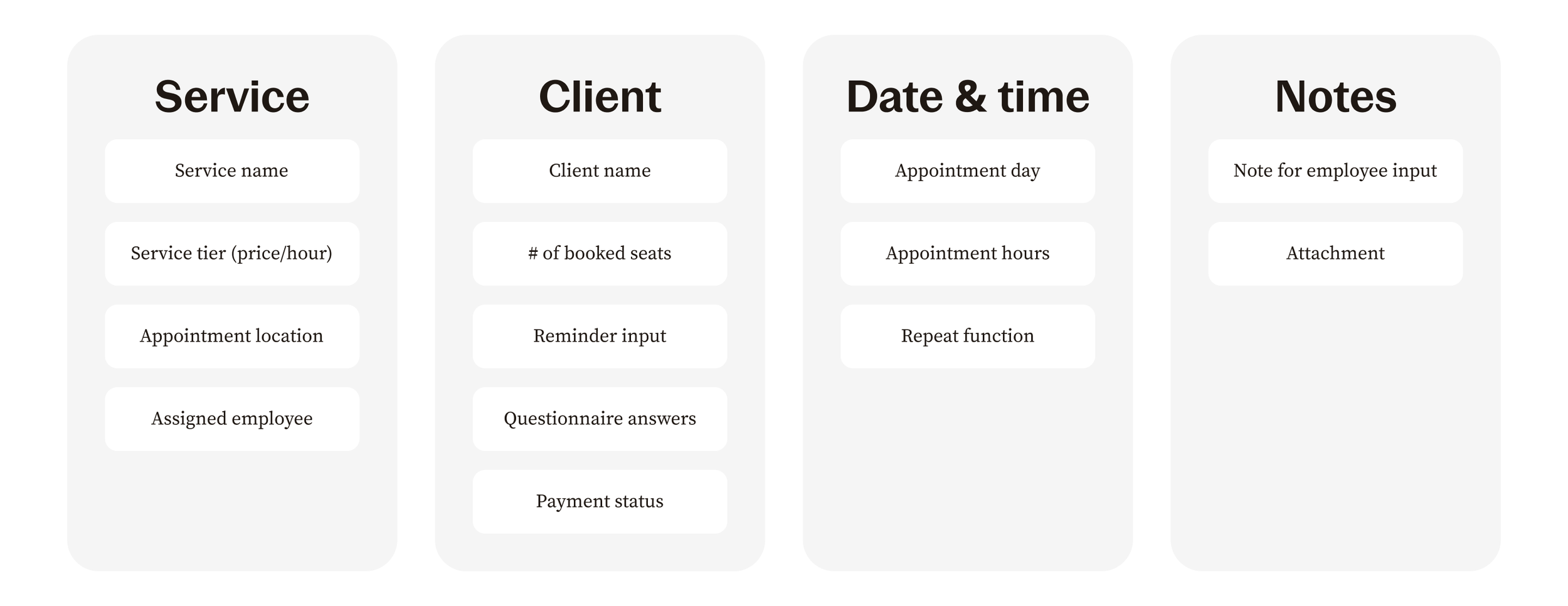
Information
The groups Service/ Client/ Date/ Notes are based on what orthodontists use to create an event quickly.
Sketch
Shows structure. Initial one was drawn in my sketchbook, this was redrawn in Krita for legibility.

2nd iteration
Images show: empty state, modal variants, filled state, mobile screens.


Outcome:
Scalability: Improved structure helps with extra inputs/ data for niche use cases (ex: group sessions, client’s home is the location.)
Reduced error rate: Key data is easier to double check after form completion.
Success rate: Users have an easier time booking an appointment manually.