

Overview
VueCloud is a web application that helps companies reduce their cloud billing by letting them visualize analytics and statistics using crisp charts, and by identifying opportunities where optimization is needed. We helped VueCloud beautify their dashboards and work through one of the most difficult UX problems for an analytics product: enterprise filtering.
Timeline: 3 weeks
Role: Product designer
Tools: Figma


Solutions
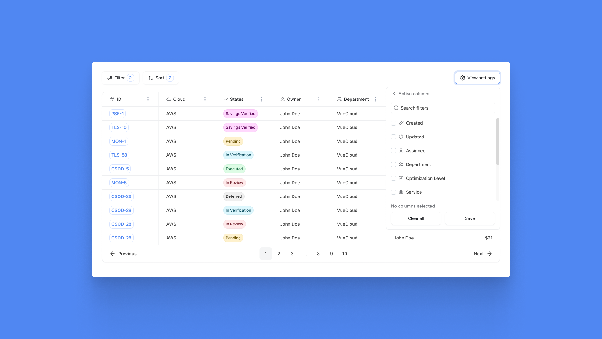
To visualize an overview of all the optimization opportunities, users can compare data points spread across up to 30 columns for each entry. The view of this table is customized using a simple and effective "View Settings" button that allows the user, through a simple 2-step process, to:
1) visualize, delete, and change the order of columns
2) search for and add new columns using a list of the remaining filters.


Unexpected challenges
Data points can be sorted and compared using a Sort function that can apply filters to all active columns that make sense to be sorted. While the Filters function only shows and hides various entries, the Sort function can lead to confusion if the user is not always aware of how many parameters have been sorted. For this reason, we made sure to use tags that communicate to the user how many filters are active or selected.

Results
VueCloud’s Overview dashboard allows for the visualization of a very large number of entries. The final result is not only clean and usable but allows for high speed, which in turn reduces downtime and increases retention. As complex operations such as filtering have been greatly simplified, users are encouraged to always be on the lookout for opportunities to optimize their cloud billing.

Interested in working together?
Feel free to reach out directly at work@florianpopescu.com.